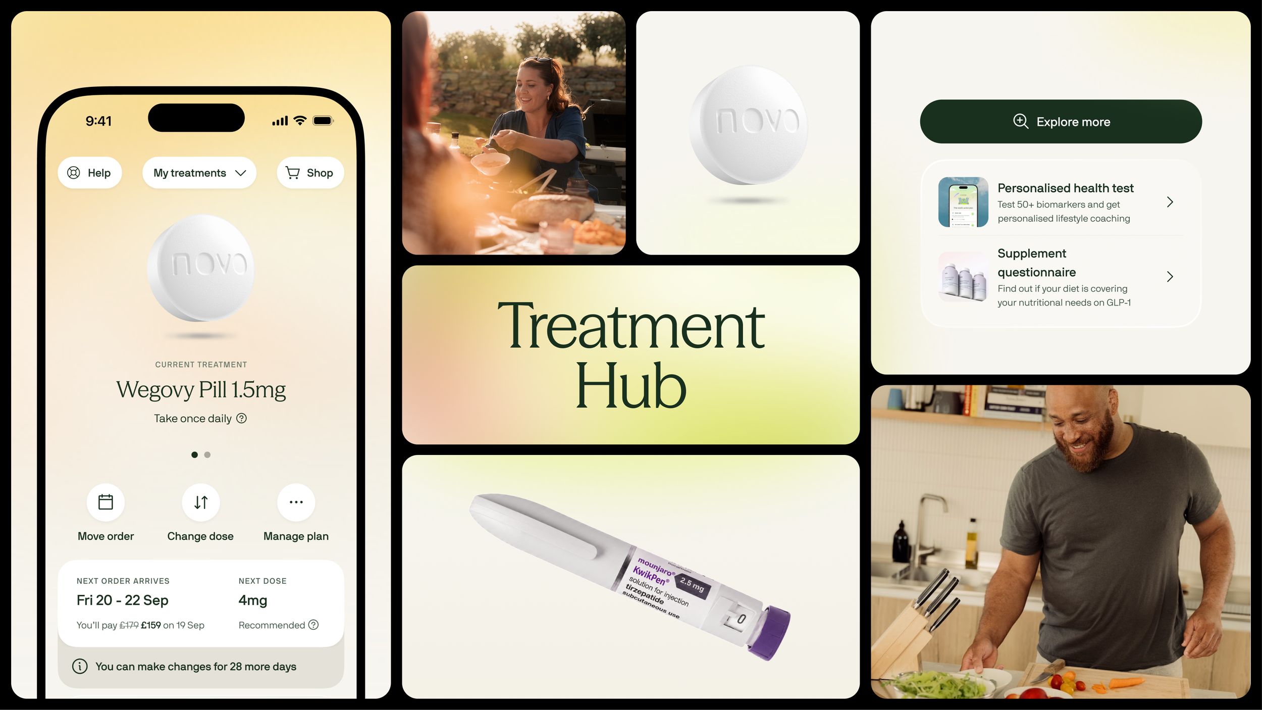
I led the redesign of one of Voy's most complex product surfaces, transforming a static subscription management page into a scalable Treatment Hub designed around retention, self-service and multi-product growth.
Lead Product Designer · Strategy · UX/UI · Validation & rollout
+11ppMore patients self-served
-21%Fewer support contacts
3.1pp
Higher cross-sell attach
+2.3pp
Higher 30 day retention
A redesign brief became a bigger product opportunity
— Context
The original ask was simple: modernise an outdated Plan page.
But the existing experience had bigger problems. It had grown organically across multiple teams, creating duplicated actions, unclear hierarchy and an increasingly difficult codebase.
Patients were also struggling with basic questions
What treatment am I on?
When am I paying next?
When will it arrive?
How do I change something?
The Reframe
How might we rebuild the Plan page into a Treatment Hub that helps patients stay on treatment, stay in control and discover the right support next?
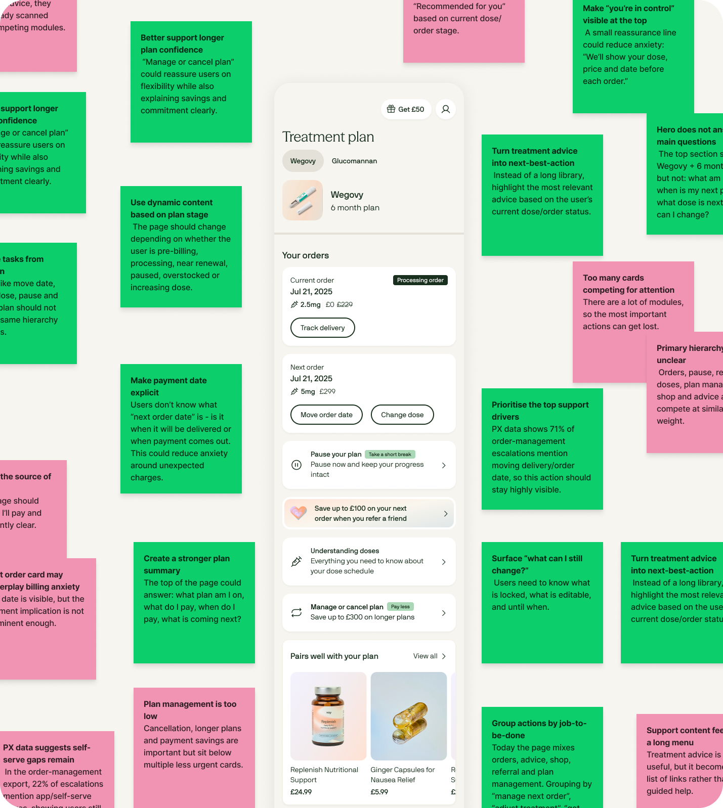
That opened up three opportunities
01
Reduce avoidable friction
Make high-frequency actions like changing dose, moving an order and pausing immediately accessible.
02
Drive ongoing retention
Surface the right intervention before uncertainty, plateaus or treatment issues become reasons to leave.
03
Unlock multi-product growth
Create a scalable place for patients to manage and discover treatments, products and services across Voy.
— Evidence
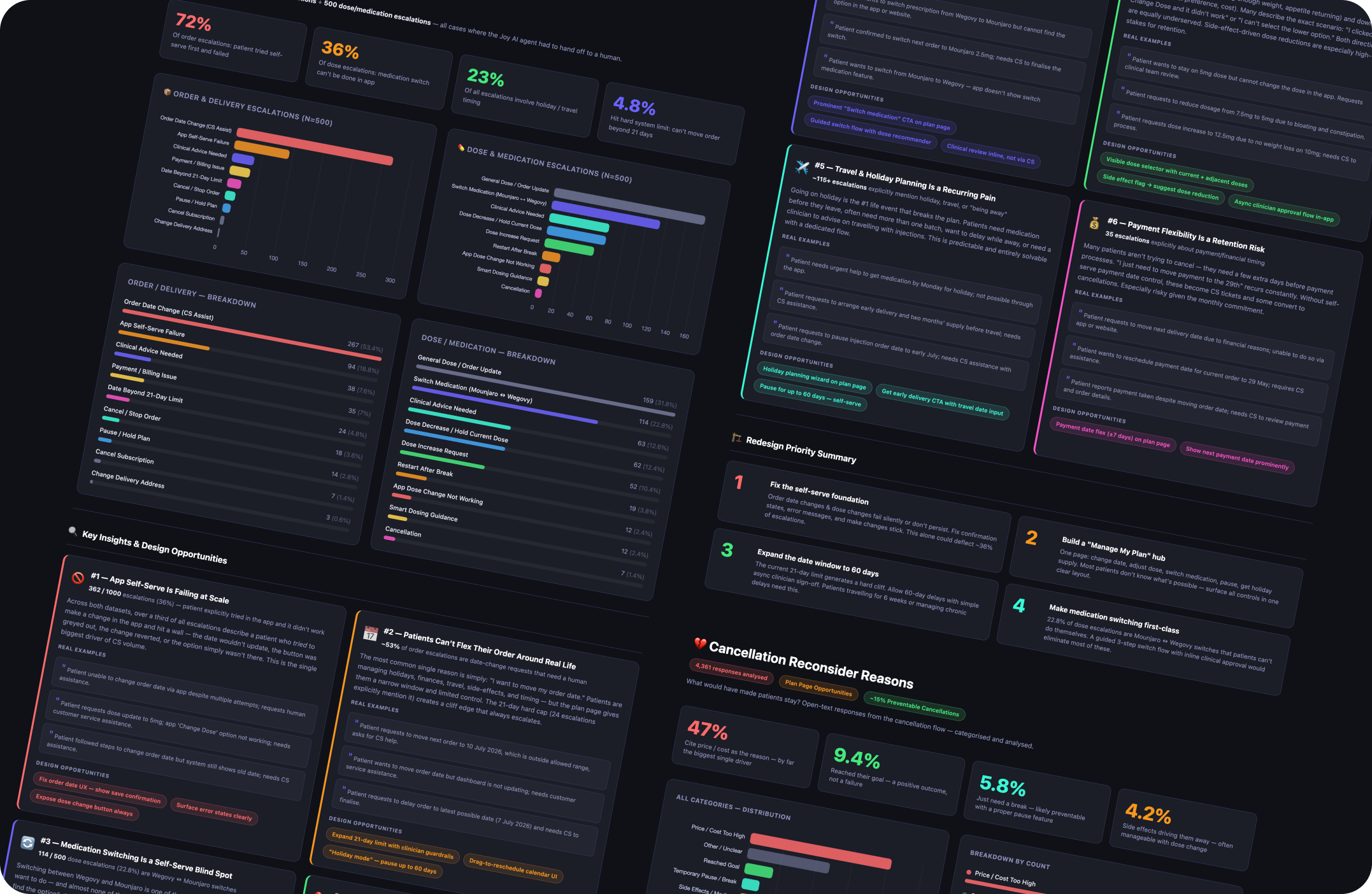
I started with the evidence
I combined PX and Joy escalation data, customer feedback, interviews, surveys and behavioural data with a full teardown of the existing experience. Four themes stood out.
Basic self-service was too difficult
Actions patients regularly needed were buried amongst a long list of competing modules. Moving an order, changing dose or switching treatment could easily become a support interaction.
The next order created anxiety
Patients wanted three things to be immediately obvious: what am I getting, what will I pay, and when will it arrive? The existing experience didn't answer them clearly enough.
Every patient saw essentially the same page
Month one and month six are completely different moments in treatment. Yet the experience treated them almost identically.
The product couldn't scale with Voy
The architecture assumed one treatment and one category, a problem as Voy expanded into hair loss, menopause, TRT, new products and new markets.
— Principles
Three principles turned those insights into direction
Make key actions obvious
Give patients immediate control over the things that keep treatment working around real life. Less friction means fewer support contacts, and fewer avoidable reasons to churn.
Guide patients to stay on track
Move away from a static page and surface the support most relevant to the patient's stage of treatment, shifting the product from “manage my subscription” to “help me keep progressing.”
Recommend trusted support
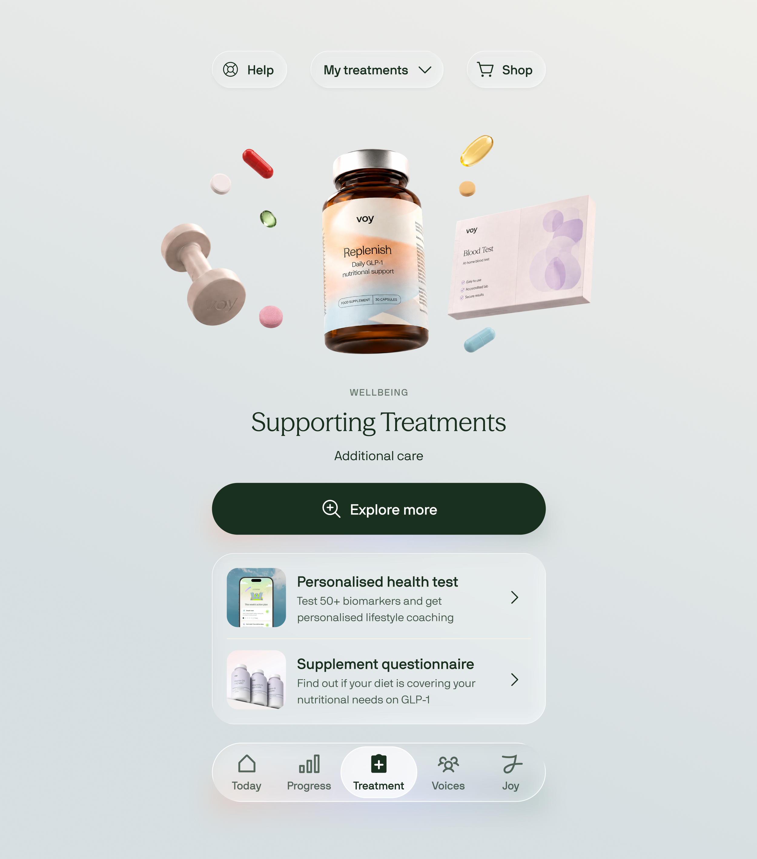
Cross-sell should feel like care, not advertising. Rather than showing everyone the same products, the Treatment Hub creates space for recommendations based on treatment, progress and need.
Nutrition support when appetite is low.
A blood test when someone wants deeper health insight.
Another Voy treatment when it is genuinely relevant.
— Direction
Looking outside healthcare unlocked the design
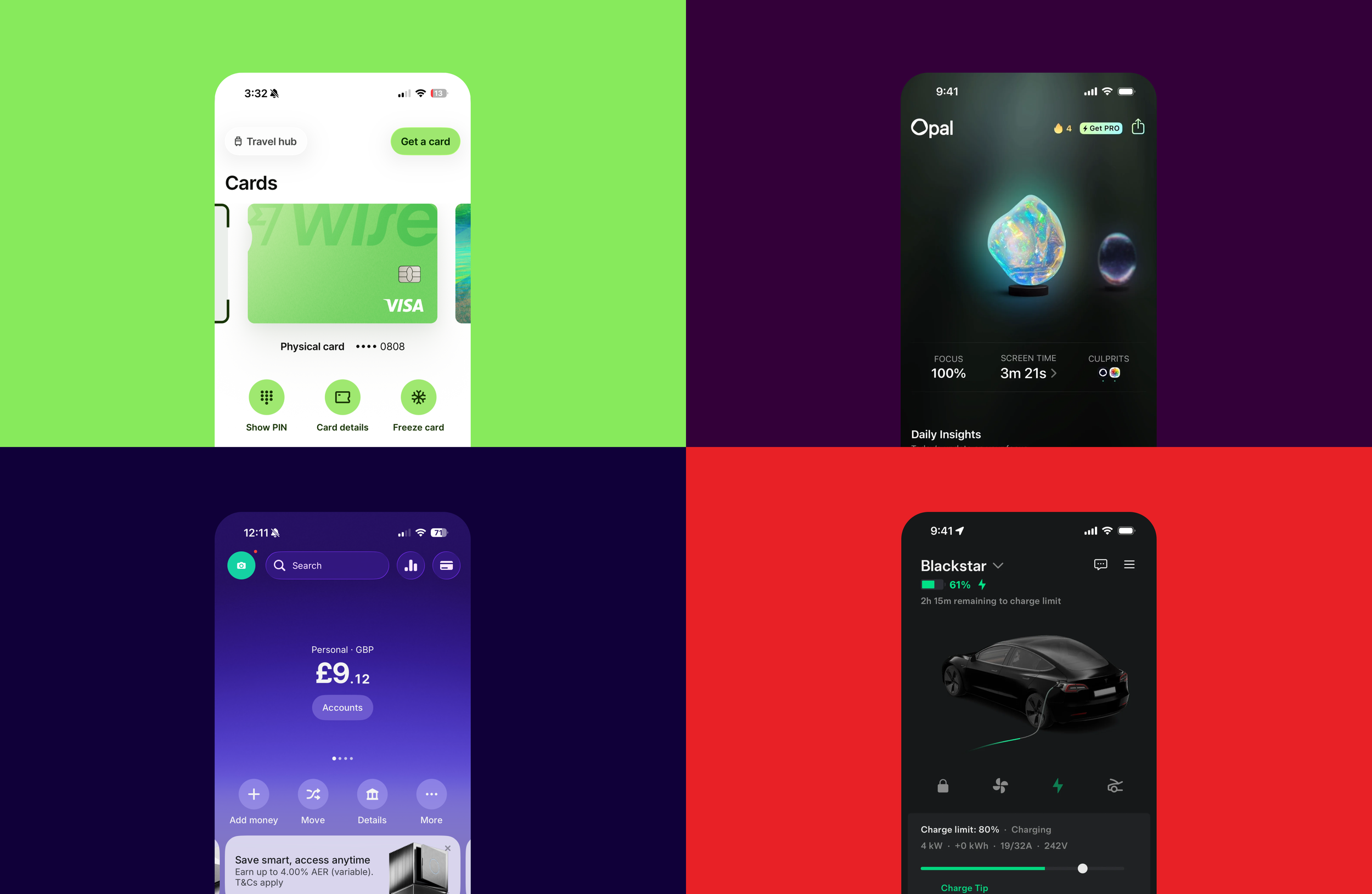
Direct competitors mostly treated treatment management as a long list of cards. Wanting to simplify far more aggressively, I looked outside healthcare at Monzo, Revolut and Wise, products that make complex financial systems feel remarkably simple. Three patterns shaped the direction.
Pattern 01
Make status unmistakable
The customer should immediately understand what they have and what is happening next.
Pattern 02
Put actions beside the thing they affect
Treatment management belongs around the treatment — not scattered across a page.
Pattern 03
Reveal complexity progressively
Prioritise what matters now rather than exposing every possible action upfront.
— The Design
From feature list to treatment-first experience
The biggest shift was changing the organising principle of the page. Instead of asking where should Pause go? Where should dose change go? Where should cross-sell go? I asked
What does this patient need to know or do with their treatment right now?
Treatment becomes the hero
The medication anchors the experience and immediately communicates the patient's current treatment.
Key actions sit directly beneath it
Change dose · Move order · Manage
The highest-value actions are always close at hand.
The next order answers the important questions
Next dose · Confirm by · Price
No hunting through multiple cards.
Care becomes contextual
Treatment optimisation, switching, clinical support and other interventions appear when they become relevant.
Additional Voy products fit naturally underneath
Products and treatments are recommended within the context of care rather than added as generic shop modules.
Making treatment feel worth celebrating
There was also an emotional opportunity. GLP-1 medication has historically carried stigma, and I wanted Voy to present treatment as something that can create meaningful change in someone's life.
I worked with a 3D designer to make the medication itself the visual centrepiece, tangible, premium and positive, rather than something hidden inside an administrative interface. The same visual system scales across future injections, pills and treatment categories.
— Journey
Designing for the journey, not just the screen
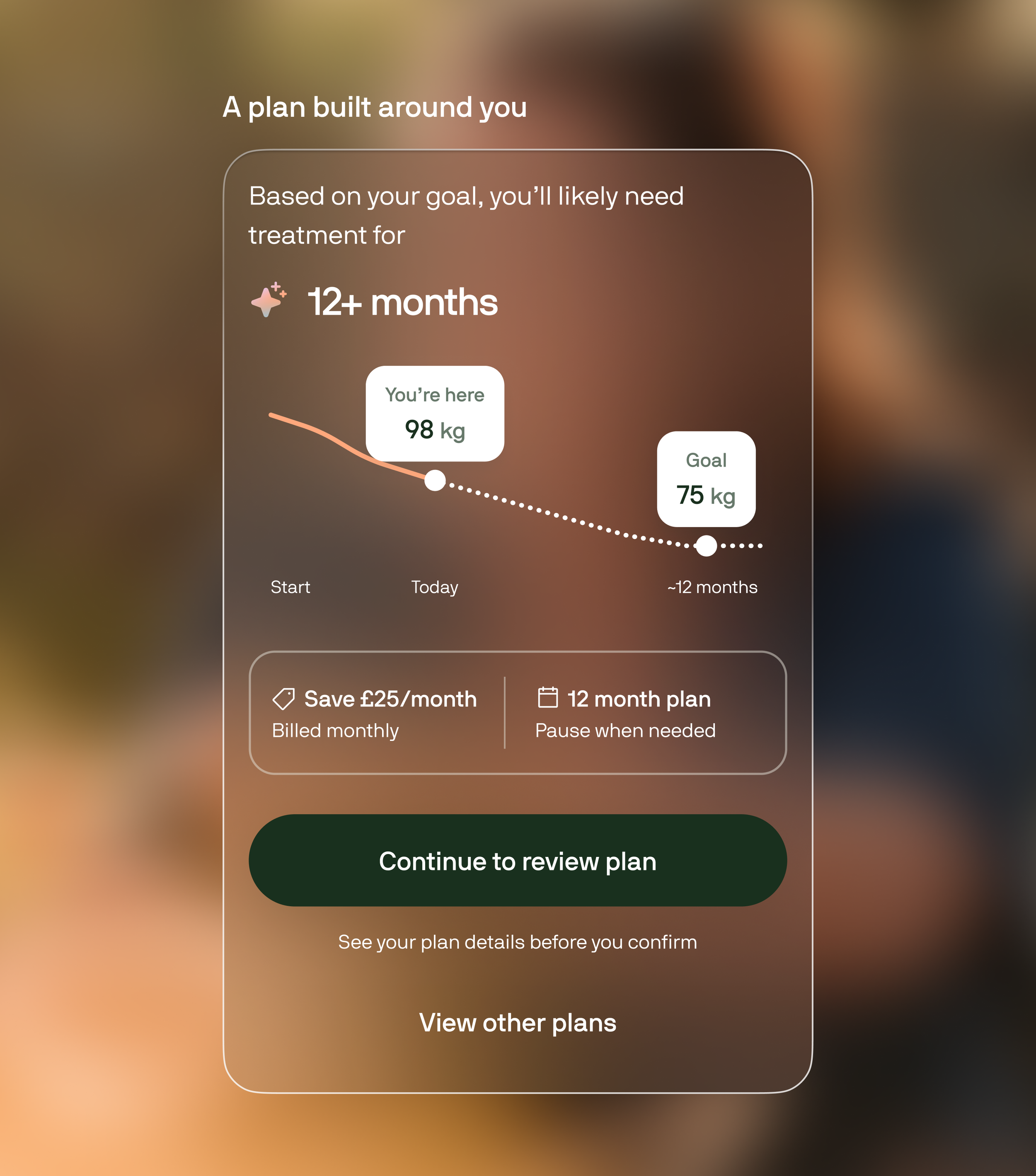
The Treatment Hub was designed to evolve with the patient, so the support on offer matches the moment they're in.
-
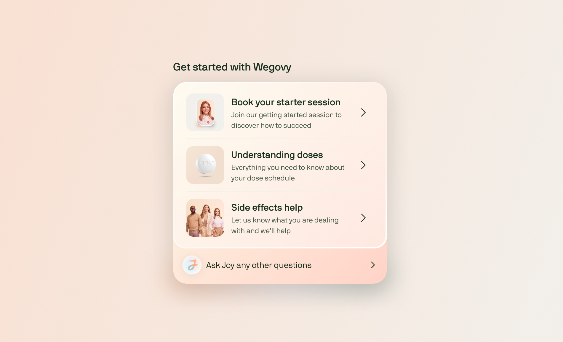
Early treatment
Getting started · Confidence · Dose understanding · Side-effect support
-
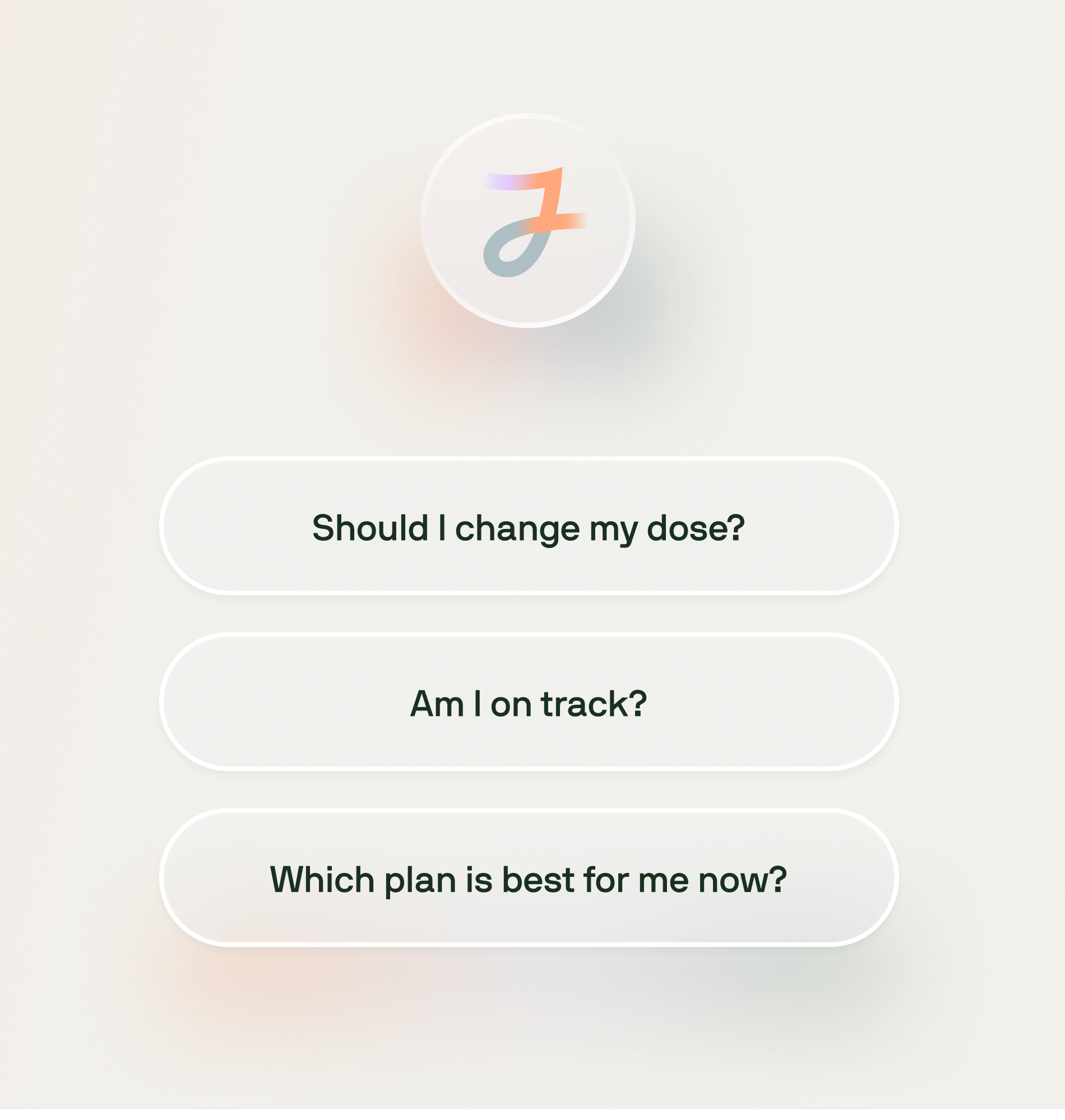
Progressing
Dose optimisation · Progress reinforcement · Treatment review
-
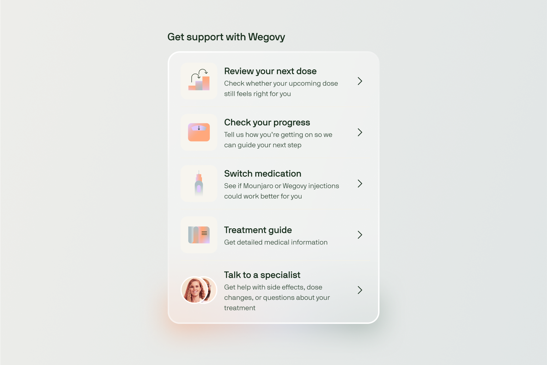
Longer term
Plateau support · Switching · Maintenance · Longer plans
— Systems & ownership
The complexity behind a simple screen
The simplicity of the UI hides a much more complicated product system. The existing page carried years of accumulated behaviour
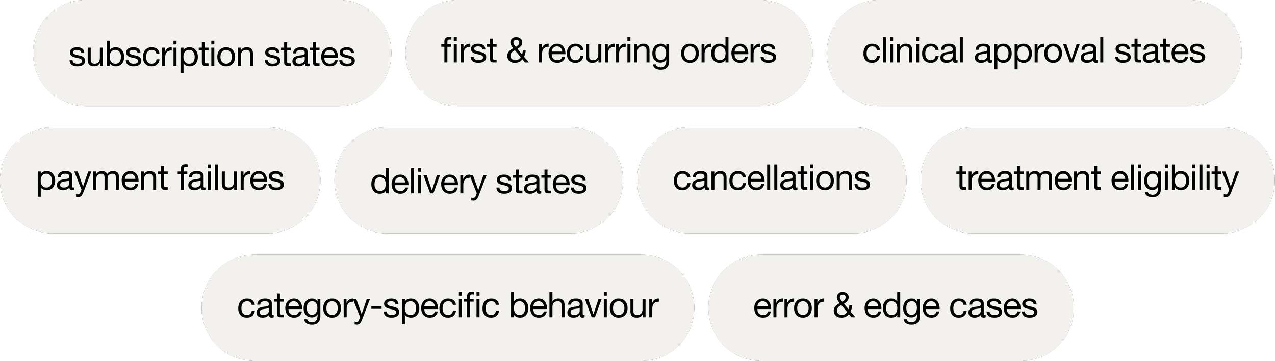
I worked closely with engineers and PMs to map that architecture before replacing it, and ran workshops with the teams behind orders, pause and treatment management to understand their constraints and make sure the new experience could genuinely replace the old one. The goal wasn't a better happy path, it was a system robust enough to become the foundation for future treatment management.
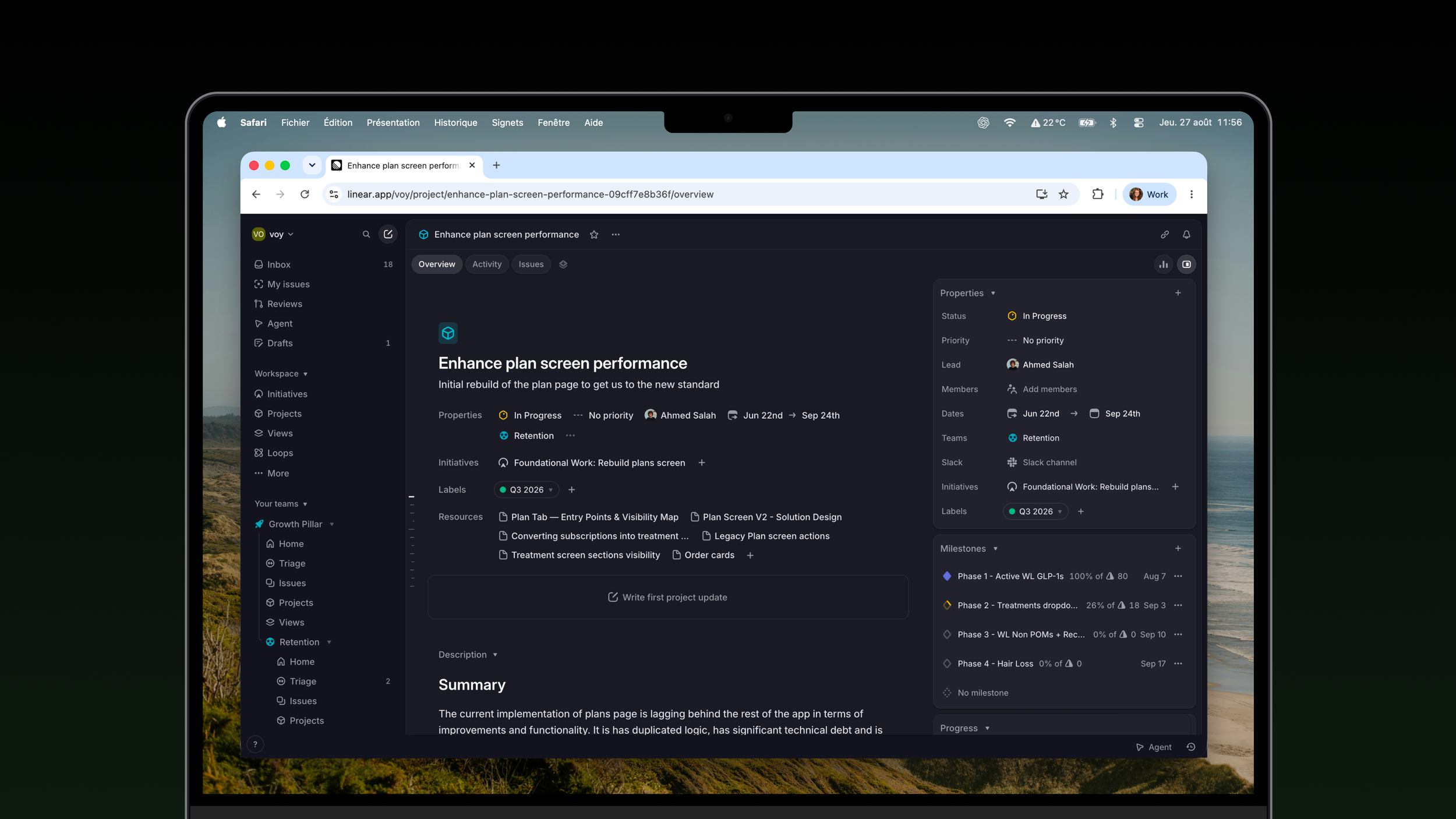
Leading a shared surface
The biggest challenge wasn't design, it was ownership. Many teams had functionality living on the Plan page, but nobody owned the experience as a whole. I became the design lead and connective point: setting the product vision, running cross-functional workshops, aligning priorities with PM and engineering, working with Clinical and PX on constraints and evidence, partnering with specialist designers on motion, and regularly presenting the direction to senior leadership and C-suite stakeholders.
The patient journey and JTDB became the framework for deciding what earned space, rather than which team happened to own a feature.
— Rollout & results
Validated carefully, then scaled
Because this is one of the most operationally sensitive areas of the app, we avoided a big-bang launch.
Step 1
Usability testing
Validate the new hierarchy and treatment-management model.
Step 2
Internal + PX feedback
Pressure-test against the issues customers raise every day.
Step 3
Controlled rollout
Release progressively and monitor customer behaviour.
Step 4
Scale
Use the architecture as the foundation for more categories and markets.
Impact
+11pp
Self-service completion
68% → 79% of patients completed key treatment tasks themselves, without needing support.
+3.1pp
Cross-sell attach
11.1% → 14.2% of patients added another Voy product after seeing a relevant recommendation.
−21%
Support contacts
Fewer patients contacted PX about orders, delivery, dose changes or managing treatment.
+2.3pp
30-day retention
Patients using the new Treatment Hub were more likely to still be on treatment 30 days later.
Beyond the numbers, we created a new product surface for retention, a foundation for
Self-service
Resolving common treatment needs without contacting support.
Longer plans
Contextual moments to encourage longer-term treatment.
Multi-treatment customers
Multiple Voy treatments inside one coherent model.
Retention interventions
Surfacing help before uncertainty or plateaus become churn.
Cross-sell
Relevant Voy products recommended within the care journey.
International scale
Reusable architecture for markets including Germany and Brazil.